Hill Crest Brand
& Visual Identity
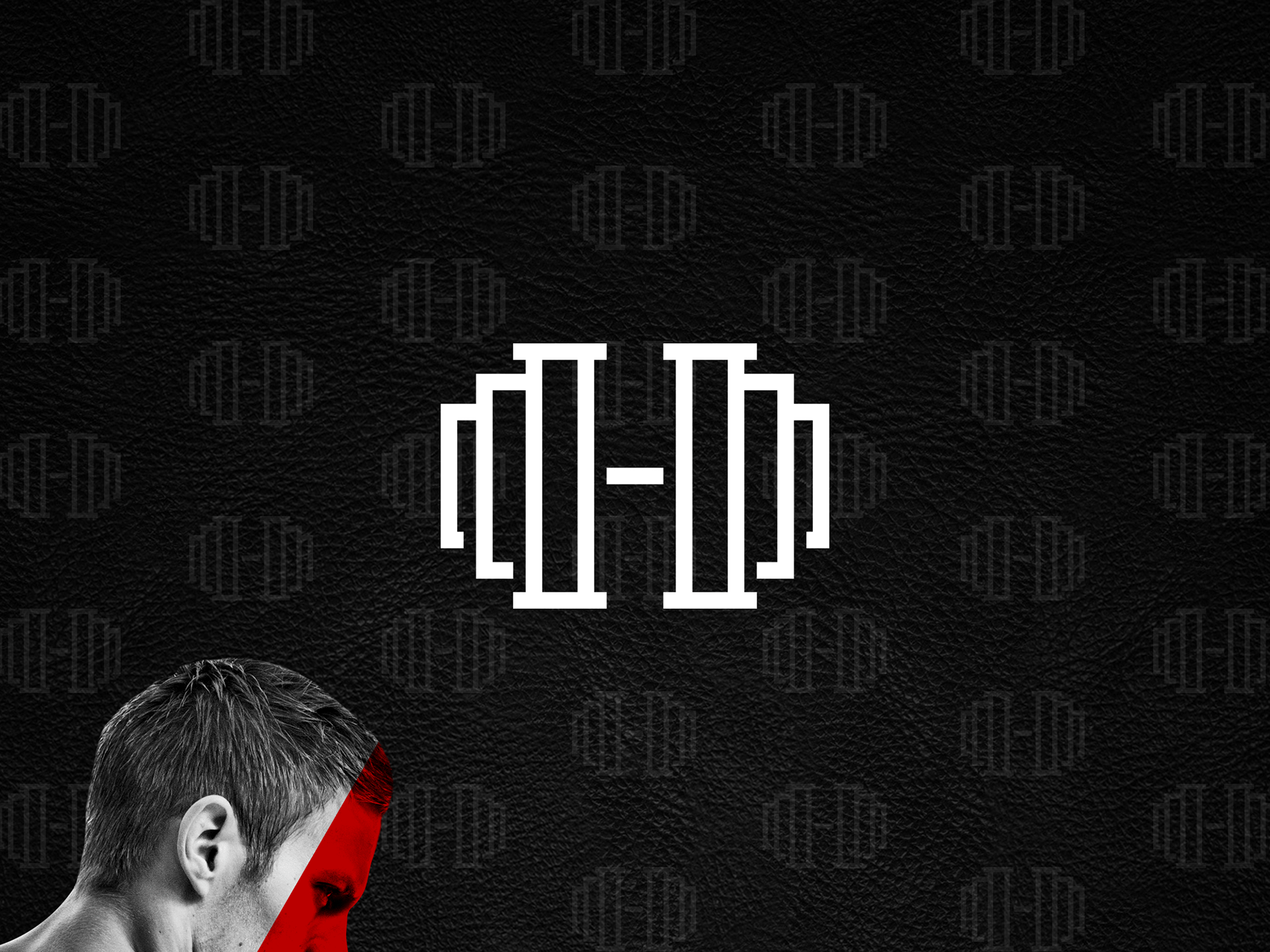
At Unicorn Studio, we approached the branding and visual identity of Hillcrest Athletic Club with a vision to blend modern sophistication with dynamic energy. Our goal was to create a brand that resonated with both seasoned athletes and fitness newcomers, reflecting the club's inclusive and empowering atmosphere.
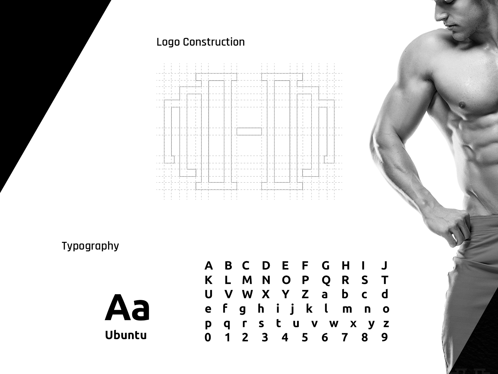
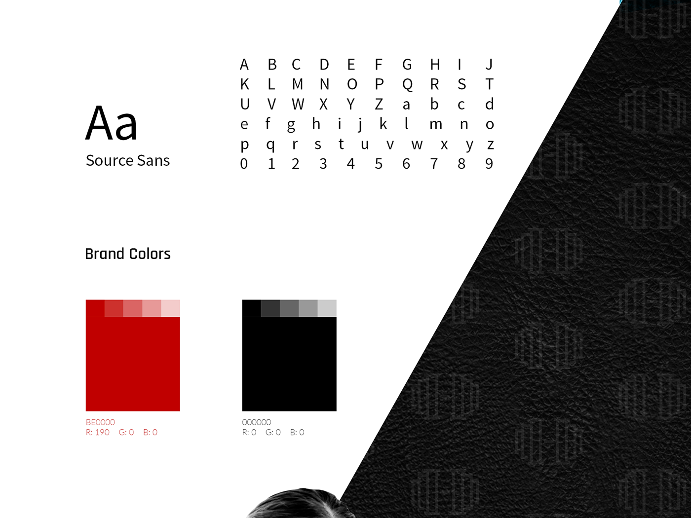
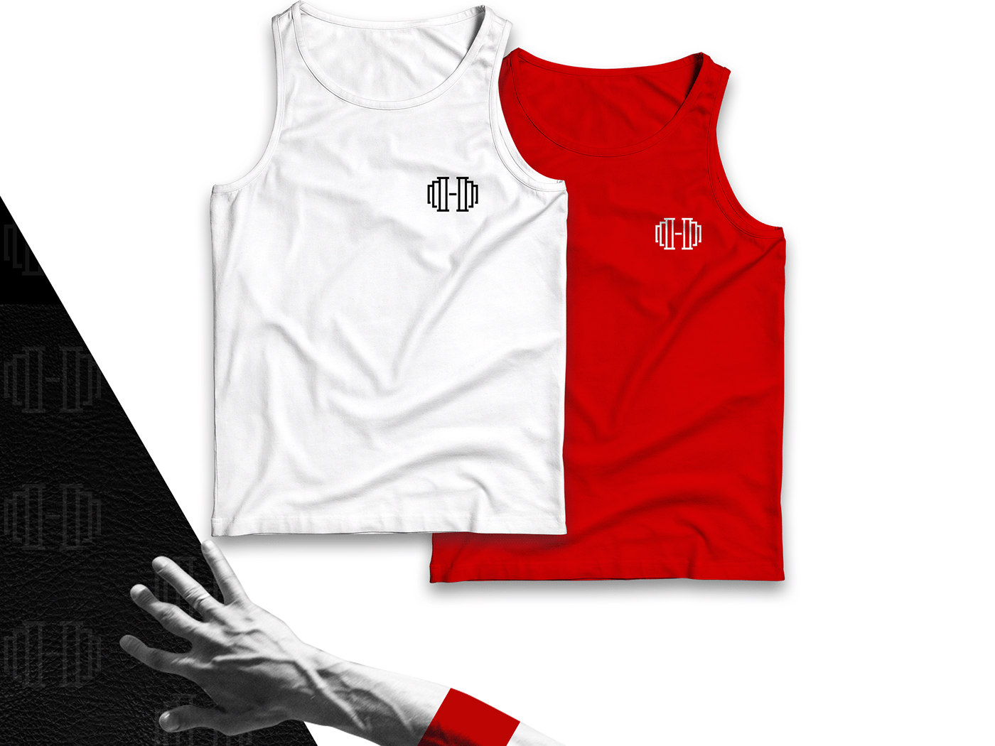
The visual identity was crafted to embody the core values of strength, vitality, and community. We selected a bold color palette featuring vibrant greens and energetic oranges to symbolize growth, health, and enthusiasm. These colors were complemented by sleek, modern typography that conveys professionalism and clarity.
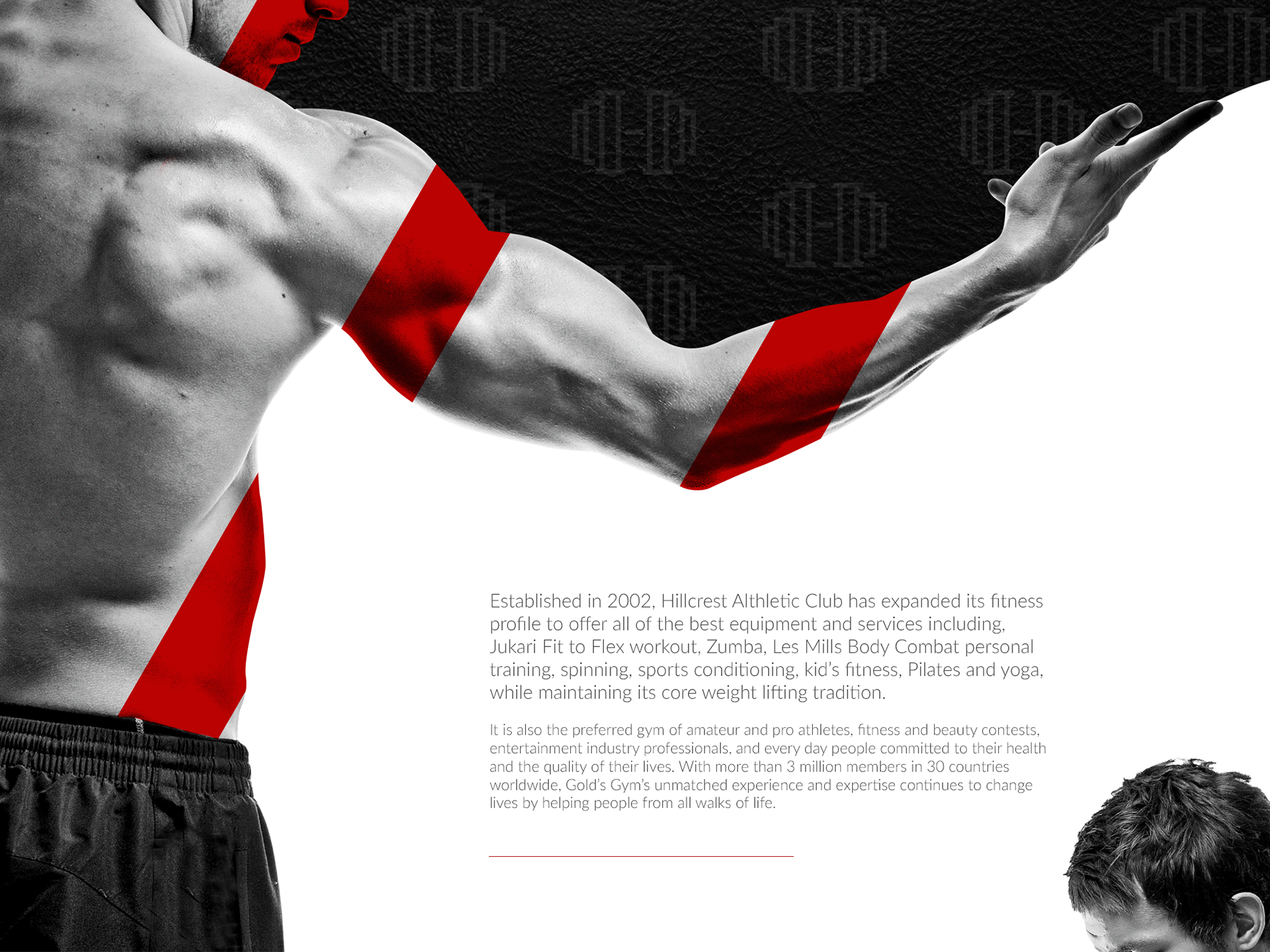
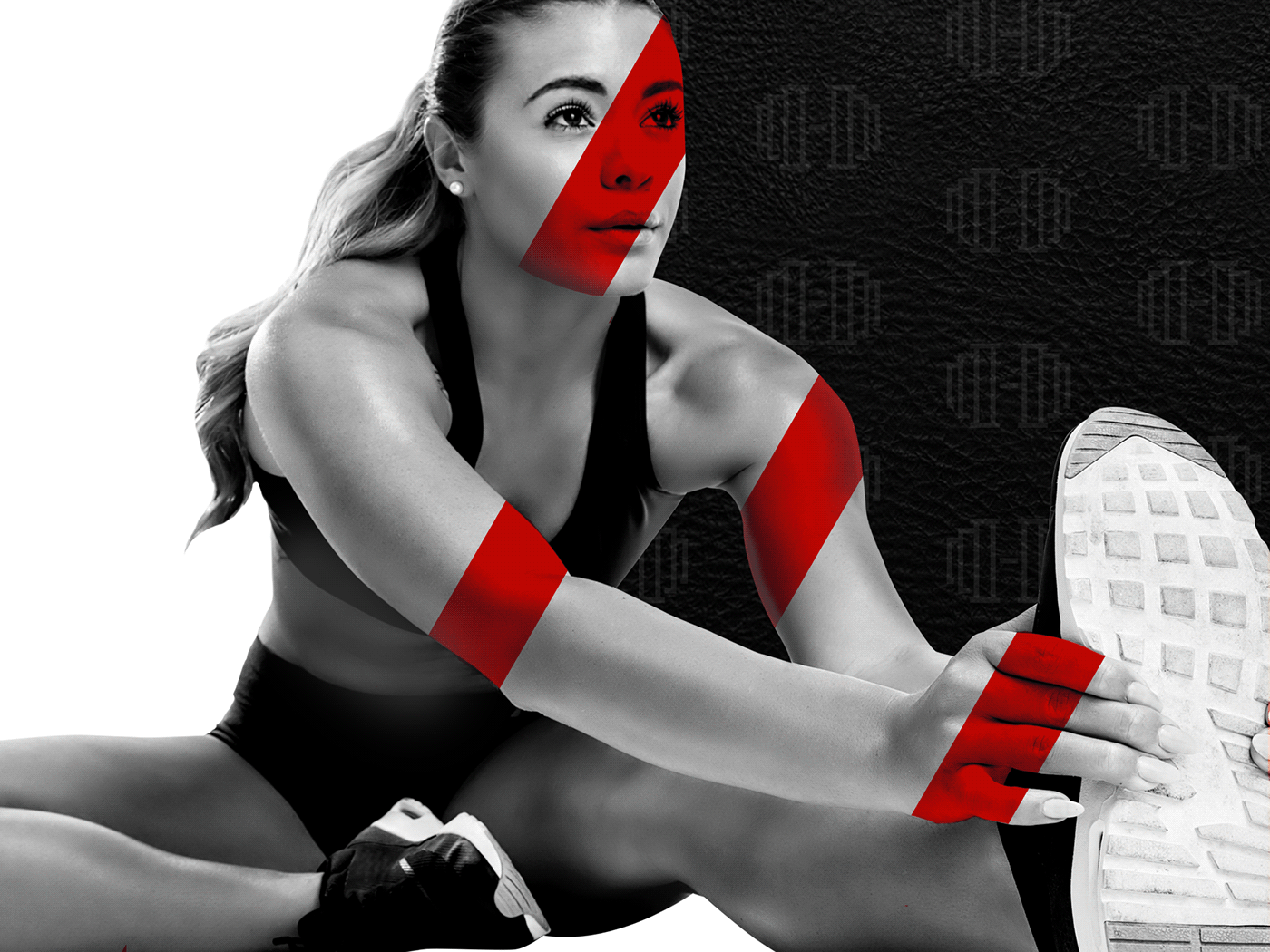
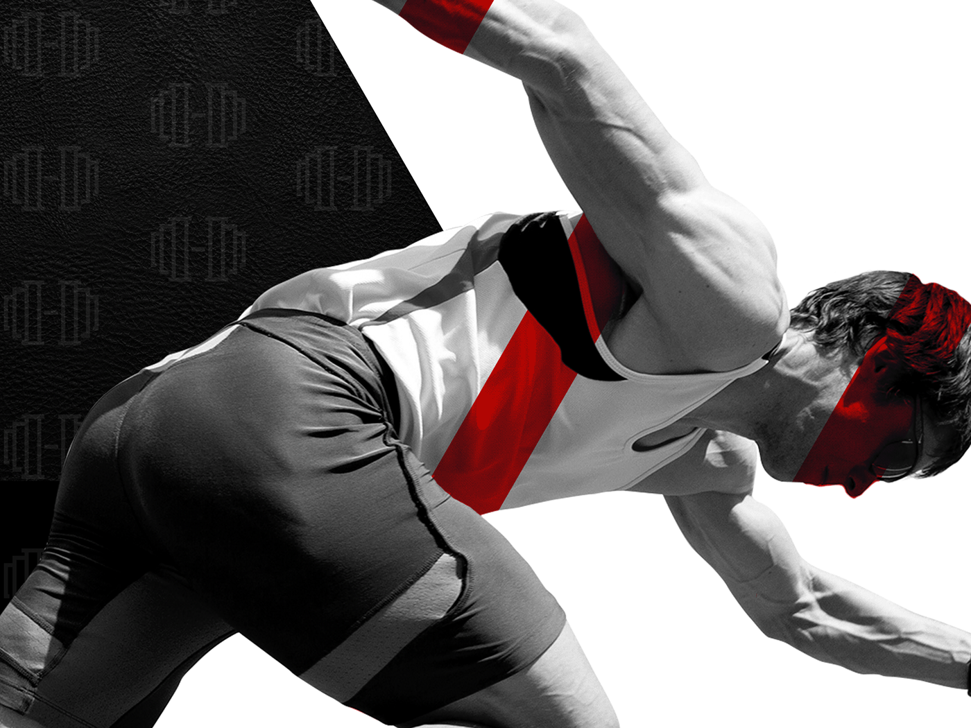
The logo design is a harmonious blend of strength and motion, incorporating elements that suggest movement and progress, essential attributes for a premier athletic club. The imagery used in the branding showcases diverse athletic activities, highlighting the club's wide range of offerings and the inclusive environment it fosters.
We also developed a comprehensive set of brand guidelines to ensure consistency across all touchpoints, from digital platforms to physical spaces. This includes everything from signage and merchandise to social media and promotional materials. Each element of the visual identity is meticulously designed to create a cohesive and engaging brand experience that inspires and motivates members.
By focusing on these key aspects, we were able to create a compelling and memorable brand identity for Hillcrest Athletic Club that stands out in the competitive fitness landscape.

Creative Direction: Mikki Sanchez
Photos: Shutterstock